Fin Facts

Prototype

Anyone that knows me is aware of my fascination with sharks. I thought an interesting idea for a project would be to highlight a few of these incredible animals in a fun and educational way. Using a combination of Photoshop, After Effects, Figma, and Procreate, I created all the app’s elements—from wireframe ideation to a polished interactive prototype. I used a lot of shark references and focused on maintaining a cohesive visual language throughout. Balancing entertainment with engaging information was a rewarding creative challenge.


Layout


For the title font of the app I wanted it to have a shark-like appearance so I added a tail fin to the ‘C’, a dorsal fin in the 'A', and sharp tips at the top of some of the letters. 


Hand-painted sharks done in a painterly style.


Size comparisons for further visual information.


When tapping the fin icons on the home page, I wanted it to feel as if the fin was moving above the surface of the water, so I added a horizontal motion when pressed.


I decided on a tooth for a home icon in keeping with the theme of the app and designed the back button like a fin facing in the direction of the previous page.

For a fun source of visual engagement, I created a danger meter to react when opening individual shark pages, animating the meter to fill up like a blood vile every time a person selects a specific shark.


Animation loop simulated the refracted light of a wave for the background of the app.

Wireframe


The Kettle Room

Prototype

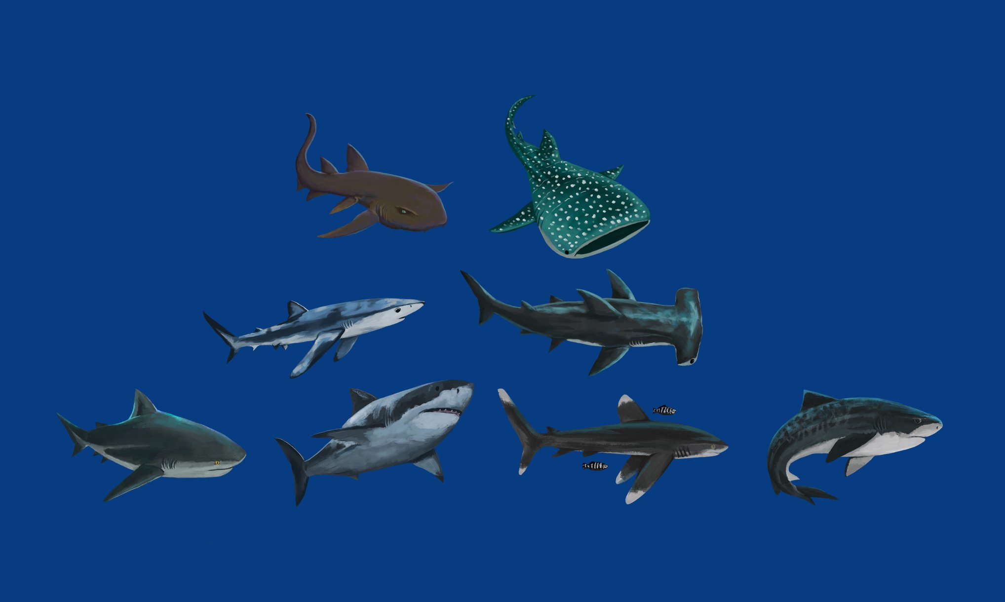
I’ve had the pleasure of dining at an afternoon tea or two. After taking in all the opulence and grandeur that usually accompanies establishments that house an event like this, I wondered if it wasn’t possible to create a user experience with interesting user interface iconography for a project of a fictional tea room—that’s when the idea for the Kettle Room was born! Using a combination of Photoshop, Procreate, and Figma, I created all elements of the app layout starting with wireframe ideation to a polished high-fidelity design prototype showcasing navigation structure. I referenced a lot of old Victorian era filigree in my button creation, always keeping elegance in mind throughout the entire layout. I wanted to allow for users to feel as if this was the beginning of their journey into a world of decadence and cordiality.


Layout

Symbols were created to represent each tea selection in every individual navigation button. Once an option is selected the user is taken to an in-depth description of the tea along with a hand-painted image of a teacup displaying the color of the tea held within.


For the curates menu, I intended to incorporate two interactive buttons, each directing users to a page showcasing a selection of food delicacies available for that specific curate experience.

For color, I envisioned a serene light mint green background, evoking tranquility, complemented by the refined elegance of polished copper and bronze tones for the icons and titles, creating a harmonious and regal aesthetic.


In the food options menu, I felt it was essential for each food title button to correspond with its specific position within the various tiers of the physical tray presented to the table. To achieve this, I designed plate illustrations to visually separate and simulate the arrangement as it would appear in front of the user. For those seeking more detailed information about the ingredients in each dish, selecting a button will lead them to a comprehensive description of the food, accompanied by a painted image of the individual dish.


Wireframe

Thank you for visiting the Kettle Room!